We all live on our phones. Stop pretending your customers don’t.
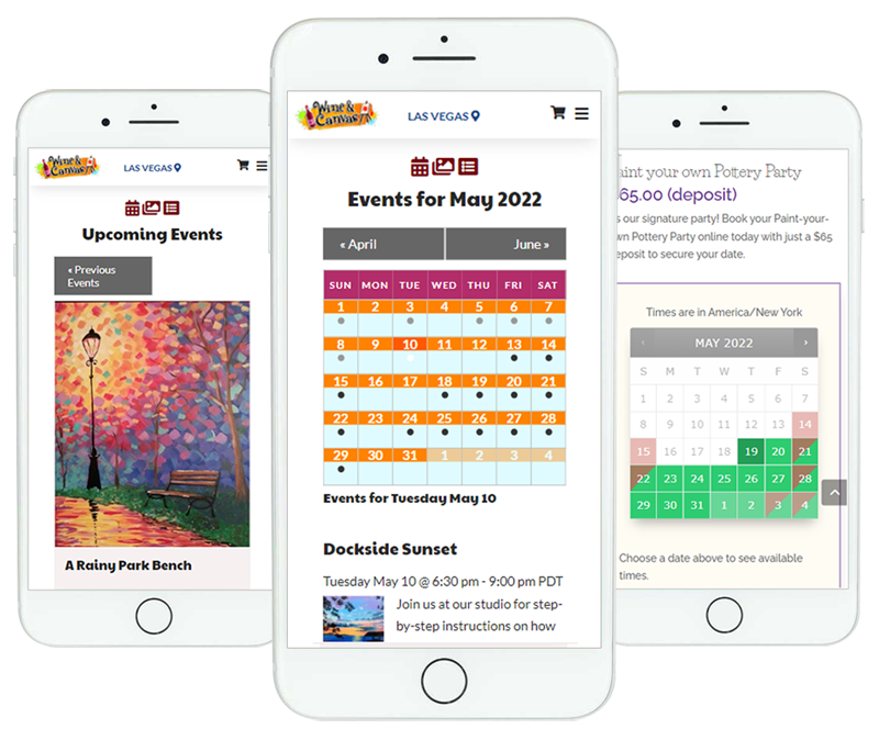
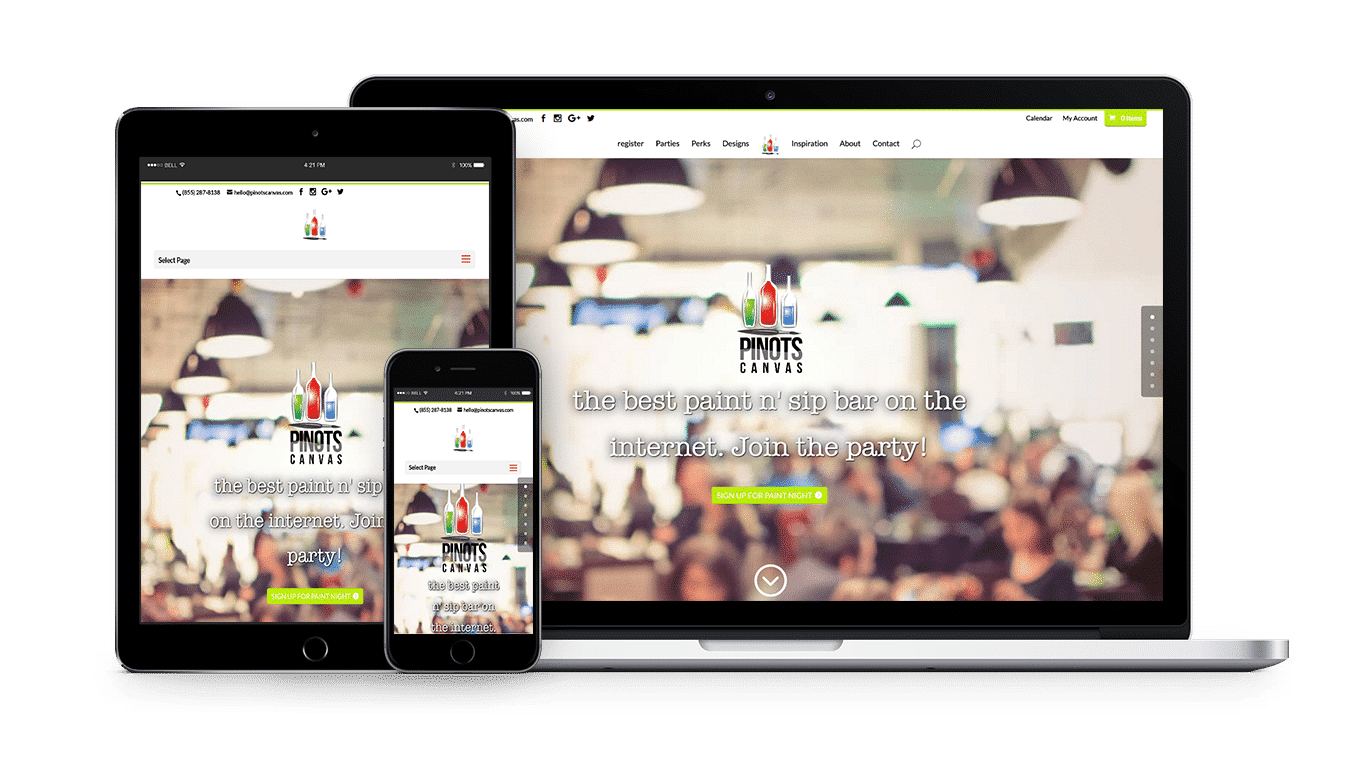
Mobile traffic is over 50% of all Internet traffic. Using a technique known as responsive web design, your Studio Engine website automatically adapts to fit any screen size on any device – tablets, mobile phones and laptops.


Do you buy things online? Do you do so from your phone or tablet?
I am sure you do. And so do your customers. They just don’t register for classes, events and parties strictly from PCs. Nope. They do it from mobile devices. And we have the stats that show that over 50% of customers purchased or signed up for events from a mobile device. Your Studio Engine website makes it now possible for your customers.
Did you get passed over already?
Back in April 2015 Google officially added “mobile-friendliness” as a worldwide ranking factor for websites. Your website’s level of “mobile-friendliness” matters now more than ever. So if you have to pinch-and-zoom with your current website, you’re not mobile friendly.

Take us out for a test drive.
Take your time and get educated. Test our demo website for yourself. Learn about our pricing and take advantage of our free consultation when you are ready to learn more.
Calendar Views from any Device
Responsive views make it easy to find events & classes from your desktop or phone on the go.
Book Parties & Services
Let your customers book reservations, appointments or services on their own letting your site do the work for you.
Single or Recurring Events
Sell individual tickets to events & classes or run a monthly, weekly, and custom recurring events.
Rescheduling Customers Made Easy
Stay off the phone and let your customers reschedule themselves to another event or class with our customer-facing rebooking screens.


